An article by Piero Barbiero, Experienced Consultant.
Business context and issues to be tackled
This was an international project for a market-leader brand. The aim was to build a digital product (web app) to enable the User to display and sell their products.
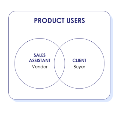
The main challenge we identified at the outset of the project was that the Customer and the User did not coincide. To clarify, ‘the User’ was defined as the owner and active user of the app (the Sales Assistant), while ‘the Customer’ was defined as the person interested in purchasing goods (the buyer) sponsored and sold by the User.
Is it possible to design a high-value, usable product that answers both Customer and User needs? Our strategy consisted in combining the basic principles of User Experience and Customer Experience and applying them to the unique product requirements.
Key stakeholders
Project
The main figures involved in the project were: the Business Management Team, the Retail Innovation Specialist, the Store Operations Manager, the Legal team, the Developers, the IT Team, and finally the Art Director, UX/UI Designers, Content Designer and Copywriter.
Product
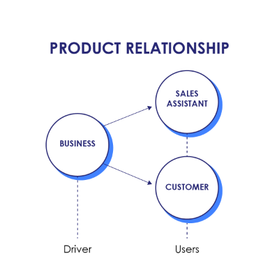
Key product stakeholders included, on the User side: the Business Management Team (leading the product development and scope of work, the product owner) and the Sales Assistant (directly involved in product sales, the active product user); and of course, on the opposite side, the Customer – the passive product user or buyer.
How we did it
Project Management
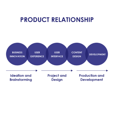
We adopted a Product Thinking approach, based on the principles of Design Thinking and Co-design. The project took place over a period of approximately four months, structured around weekly agile sprints, with remote collaboration across different locations enabled by professional software.
These were the different project strands that were being developed and integrated into product design:
- Business and organizational trends
- Sales logic
- Legal restrictions (at the international level)
- Data sourcing and database structure & integration (CMS, Master Dataset, Database)
- Content mapping, content guidelines and style guides for the interface
During the preliminary phase, we conducted interviews with Sales Assistants and Store Operations Managers in order to gain an in-depth understanding of the different tasks, actions and behaviors they perform/observe on a daily basis, and how these influence their ability to meet their targets.
During the design phase we worked closely with the IT team, the Developers and Digital Experts and once again with the Store Operations Managers – we would present the different iterations of the project we had developed at the time in order to gather their feedback on product feasibility and effectiveness. This was repeated at each sprint cycle in order to ensure continuous product improvement.
In general, these were the main drivers shaping product development based on the different needs of the key stakeholders:
- Business Team: content, data and value-driven
- Active User (Sales Assistants): function and operation-driven
- Passive User (Customer/Buyer): needs and narrative-driven
Key assumptions:
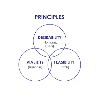
- UX and CX design must always be guided by the principles of desirability and economic as well as technical feasibility
- The project must never lose sight of the core business needs and scope
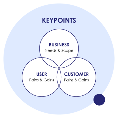
- The various pain & gain points for both User and Customer must be correctly identified and integrated into product development, carefully managing any compatibilities or potential conflicts
- The different pain & gain points need to be further evaluated based on their weighting and on how conducive they are to the business needs and scope identified at the outset of the project.
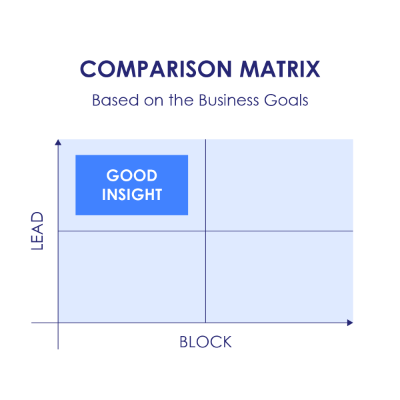
As for product insights, they also have to be evaluated against the business objectives identified at the outset of the project that is, to what extent each insight contributes to drive (or indeed hinder) these business objectives. Does this help us get closer to our targets, does this slow us down, complicate or altogether block achievement of the goals?
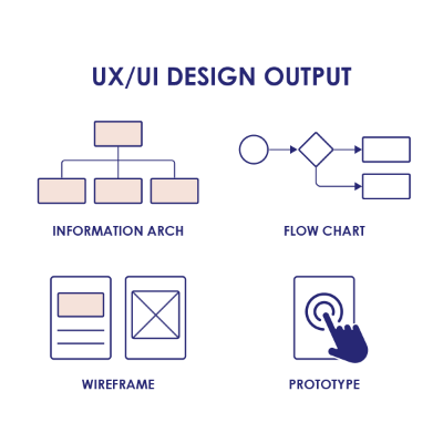
UX/UI design focused on Information Architecture and Design, Content and Interaction Design, but also covered the visual elements of the User Interface. One of the most salient aspects of the project was definitely the collaborative approach across different stakeholder categories, as exemplified by the surveys we conducted to identify pain & gain points, and above all by the weekly presentation & revision sprints, during which we would review use cases and content mapping, as well as successive iterations of wireframes and prototypes for the app.
In the post-launch phase, we will be gathering feedback from both users and customers in order to integrate the necessary design modifications into any new releases.
Output: the product and key product features
Our aim was to generate added value for both the User and the Customer, specifically along these key axes
- User (Sales Assistant)
- Data gathering and storage
- Simplified processes
- Guidance
- Customer (Buyer)
- Engagement
- Interactive and responsive features
- A visually appealing product and content
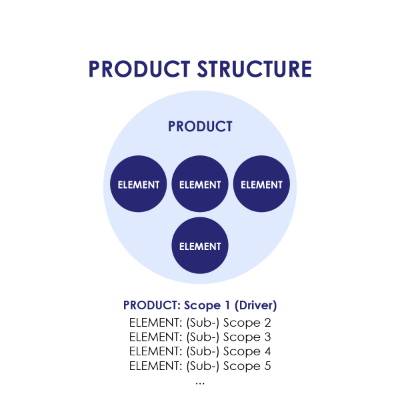
Here are, in detail, the key product features categorized by stakeholder
- User (Sales Assistants)
- Quick navigation
- Real-time filtering of all items
- Feedback (real-time reporting of any errors, issues and task completion)
- Product configuration recap always accessible
- Show/Hide items (eg. Prices, Brands, etc)
- Total purchase price always visible
- Logical positioning/displaying of the products (eg. Best Sellers, or depending on the customer needs highlighted in the survey)
- Guided and free configuration stepper
- Product indexing, catalogue and filters
- Upselling logic
- Customer
- In-depth navigation
- Overview of specific solutions by interactions and information
- Need-based survey questions and suggestions (usage, lifestyle, etc)
- A content and information-driven visual experience
- Immersive and engaging experience
- Detailed product configuration
- Product comparison
- Clear pricing
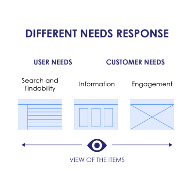
Final considerations & take away message
We were able to integrate Pain & Gain points for both Users and Customers within the project and the product itself: this resulted in an enhanced digital experience, guaranteeing usability and quality content and generating added value for both stakeholders.
Here are some examples of positive feedback we received on our product:
- A customer-oriented product, designed with customer satisfaction in mind
- Customers and customer needs were carefully profiled and understood
- A very detailed product providing richer, more in-depth information and visual content
- A product that actively supports and improves Users’ tasks
- Clean, intuitive and simplified action flows
- The right elements were prioritized
- Very brand-oriented (across the different brands featured in the product)
- It provides effective solutions to different needs
So, to recap, is it possible to reconcile two different perspectives and create a high-usability and high-value product? It most definitely is!
Get in touch!
Our dedicated UX/UI Team can provide effective, customized solutions for all your digital product design needs.
